proper chips
Taste the streets
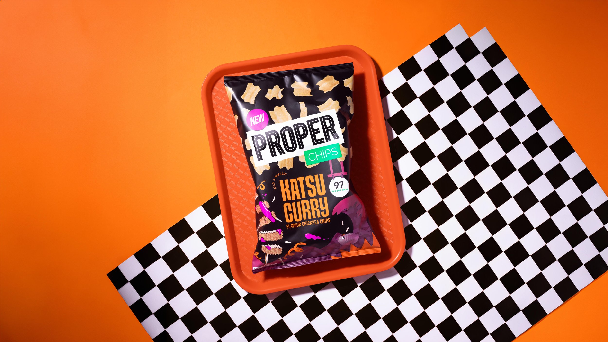
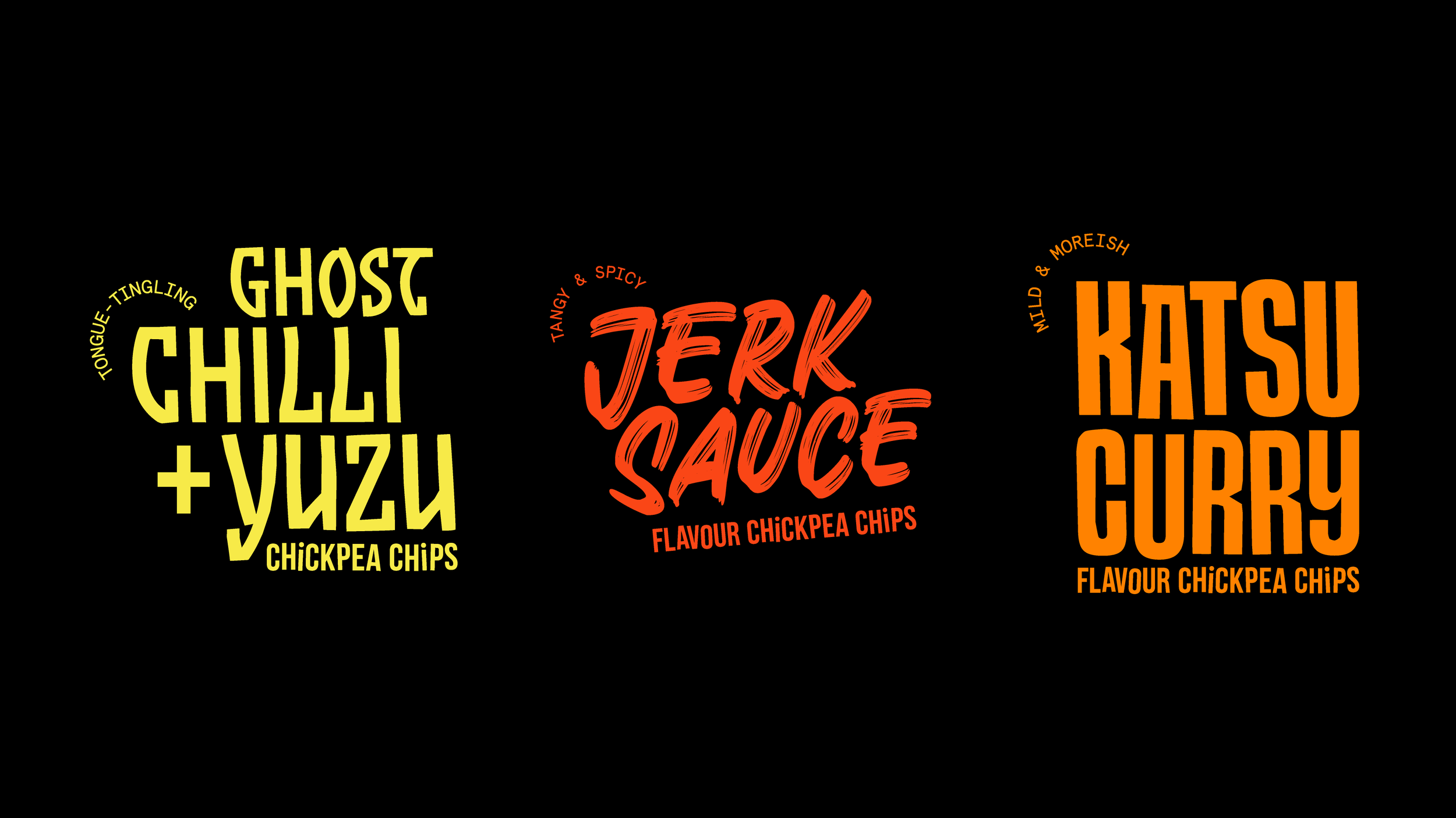
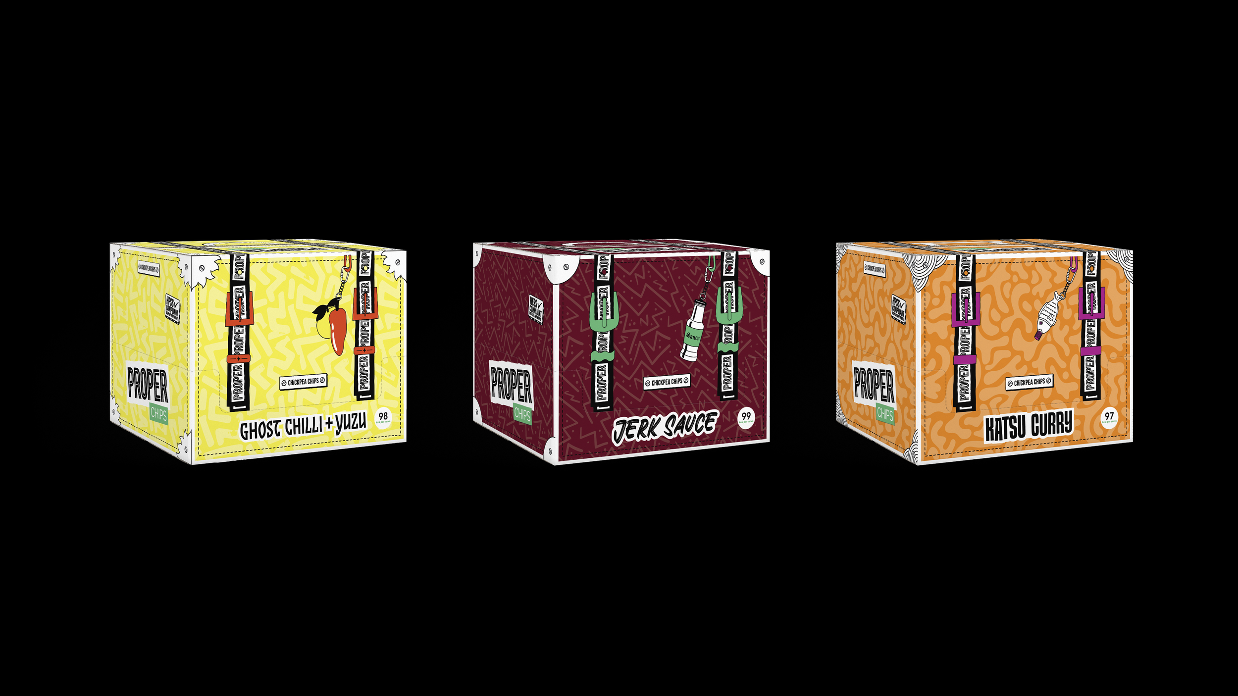
Following the consistent success of their lentil chips, PROPER approached us to design the world for their new range of chickpea chips. The product proposition of ‘taste the streets’ is reflected in the dynamic style of the illustration and typography used on each pack, referencing the diverse culture of London street food start-ups.
Client
PROPER Snacks
WE partnered on
Packaging Design
Date
January 2024
Animation
NFB Studio
Visit Site
Photography
Nathan Joyce
Visit Site


“We’ve commissioned the incredibly talented Studio Evka to illustrate several pieces of packaging for PROPER. The designs are always very colourful, playful and really well thought through, with different characters and backstories that add depth to our packaging, making them come to life in such an imaginative way.”
Kiera Maclean, Studio Manager at PROPER Snacks


Alive and kicking
Keeping the illustrations static did not seem like the right thing to do for a flavour range as dynamic as this. So for the first time in PROPER’s brand history, we worked with them to bring these flavour-lead characters to life.
As well as animations, each character comes with a colourful backstory to help the team talk about the flavours in the range when pitching to retailers. Loud flavours call for loud characters like Kitty the Katsu Chicken, Casper the Ghost Chilli and Bonnie the Scotch Bonnet.
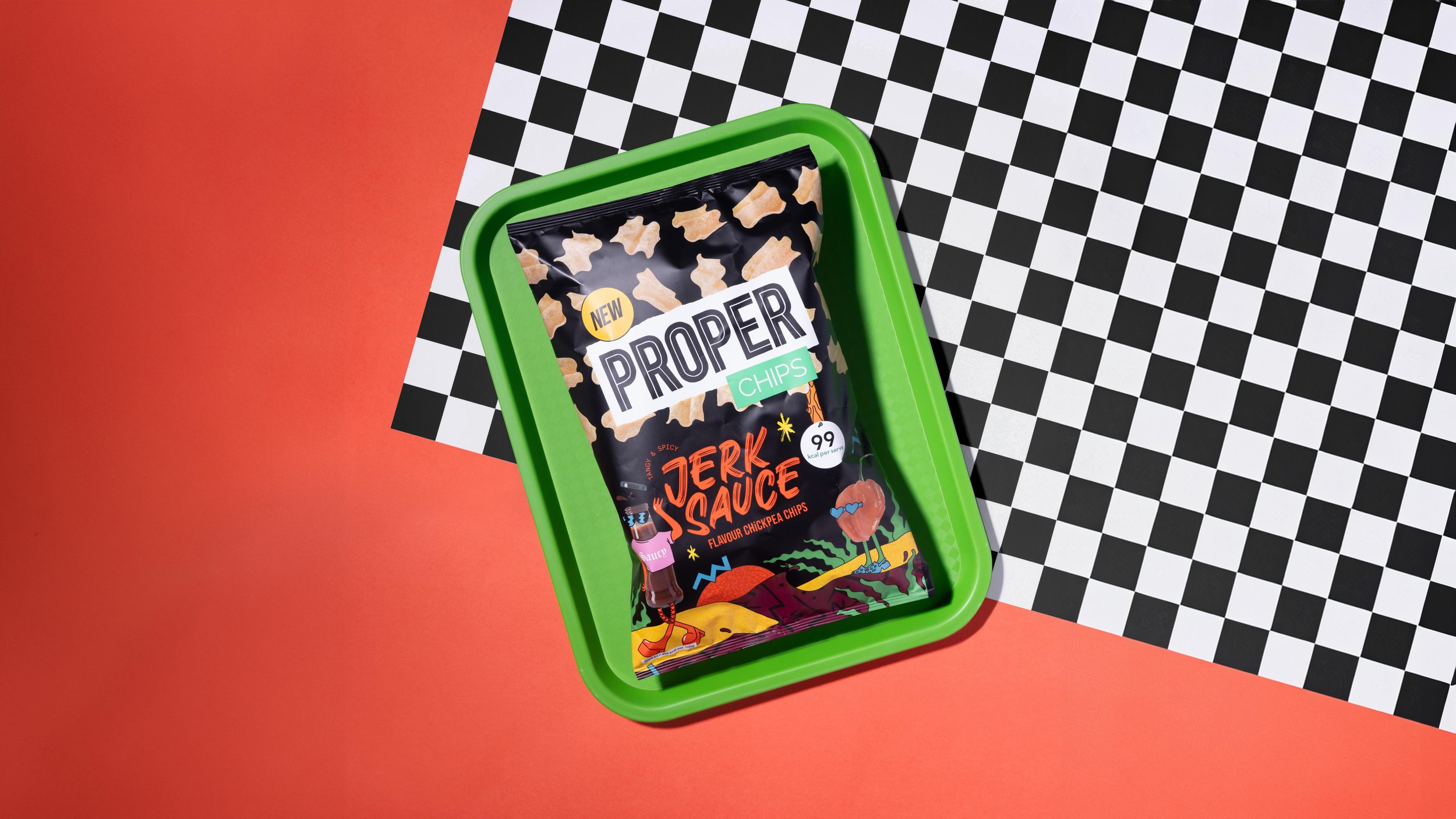


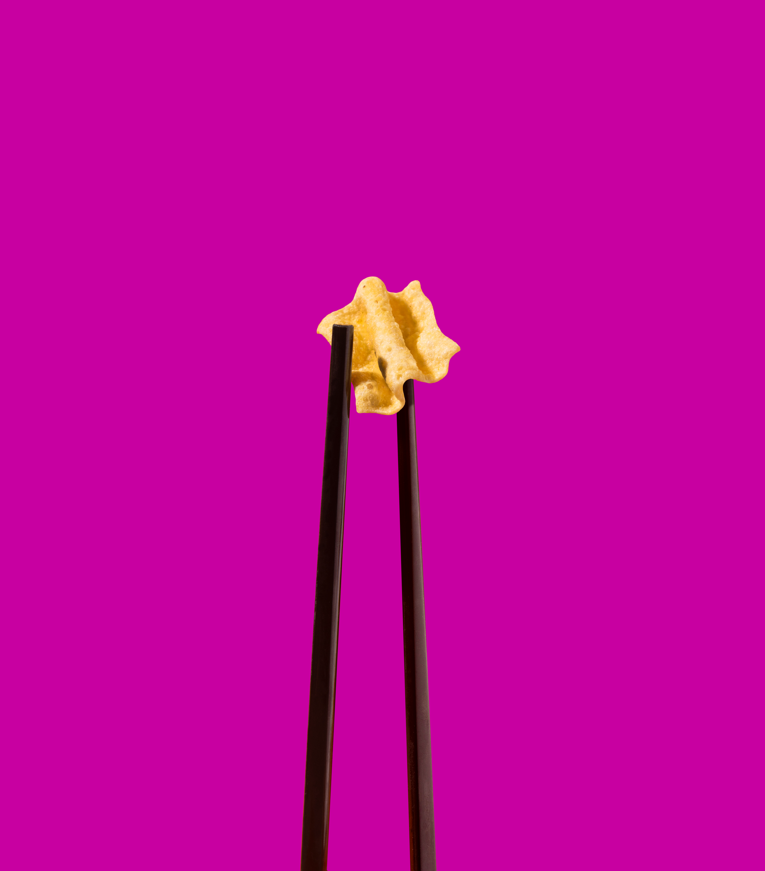

Above
Product photography by Nathan Joyce
Right
Lifestyle imagery shot in Market Row, Brixton